

Make maps of research interactive, detailed and open!
Network maps are essential tools in quantitative research studies. In this blog post I argue for interactive maps that show both overview as well as details, are openly accessible, and based on open data. Such maps add value by providing more information, enhanced transparency and interpretability.
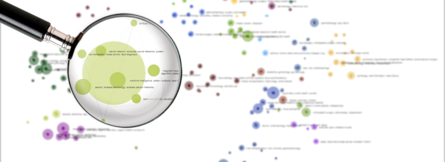
Bibliometric maps have been created for decades to provide overview of research and to make it possible for researchers to study different aspects of the research landscape, such as collaboration patterns, structure of research fields and citation relations. Several tools have been created that make it easy to create maps from bibliographic records imported from different data sources. Using these tools, maps can be created without any coding. The end result is often a static image showing some nodes and their relations. The maps are useful, because they simplify large amounts of data and highlight patterns in the data.
Static maps must be reduced to a limited number of nodes and edges to be readable. If we deal with large publication sets, this means that data must be either heavily restricted or aggregated. A lot of detail is being lost in this process, leading to reduced transparency and decreased interpretability. A new version of VOSviewer has made it possible to create bibliometric maps and publish them online. Such maps offer more interactivity by zooming capabilities and information can be shown when clicking nodes or edges. This interactivity makes it possible to visualize more nodes and to provide more information.
In a visualization of a classification of biomedical research literature, based on more than 3 million publications in PubMed, I go one step further. The visualization provides interactive features to navigate from broad disciplines down to narrow topics and retrieve the publications underlying the classification. Thereby, the visualization provides both overview of a vast amount of research literature as well as details down to individual publications.
The visualization, which shows the recent three years period (2018-January 2021) is based on a classification of publications created by clustering publications in a citation network. The full classification currently contains about 18 million publications in PubMed from 1995 onwards and has been based on open data (PubMed and the NIH Open Citation Collection). All data are available in figshare.
Three levels are visualized in the map: (1) broad disciplines shown as large nodes, (2) underlying specialties shown as a network of smaller nodes and (3) topics shown as lists when clicking a specialty. From the list of topics, a link takes the user to the underlying publications in PubMed. Details about the classification and visualizations are described in a recent preprint titled “Improving overlay maps of science: combining overview and detail”.
Using the map, one can for example study research related to the ongoing pandemic caused by SARS-CoV-2. The underlying topics in the Covid-19 cluster shows research focusing on mathematical models of the outbreak, clinical treatment, psychological impact, testing methodologies and specific symptoms. By the possibility to retrieve the individual publications, the map can be used for exploration and information retrieval. Most maps of research do not provide this feature.
Another application is the opportunities given by overlays. We may for example set node sizes or colors based on some variable, such as open access publishing, citation rates or growth rate. This makes comparisons of fields possible. For example, this map of open access publishing shows a high share of open access publishing in corona virus research, but a low rate in biophysics and biochemistry. The map provides both overview of the open access publishing as well as details down to narrow topics.
Interactivity and detail facilitate interpretation. The user can use information about relations to other clusters, underlying topics and retrieve publications when interpreting the contents of clusters. Nevertheless, many challenges remain. Clustering methodologies can be improved by making the resulting classifications easier to interpret, also outside the field of quantitative science studies. Overlaps of fields may be integrated into the maps and there might be better ways to position the nodes in the maps. I think that visualizations of this kind make weaknesses more apparent and provide a good point of departure for further development.
The results of the clustering methodologies are made transparent by providing interactive features and by making the maps and underlying data openly available. Anyone can navigate the map and get an impression of its validity, and anyone can download it and evaluate its strengths and weaknesses. My hope is that this transparency can contribute to improved clustering methodologies and more user-oriented maps of research. I think that bibliometric maps of other types should follow this example: (1) make the maps interactive, (2) provide as much detail as possible, and (3) make the underlying data openly available.
0 Comments
Add a comment